Android Headings
Let’s have a look at the headings in this post as an ordered list. By listing them out it helps me create a logical flow to the post. Also, it gives the reader an understanding of the progression. And by creating links it’s far easier to navigate.
Introduction
In this article I am going to take a look at headings from the perspective of the Android engineer. I want to discuss where the misunderstandings and misconceptions come from. From there we can draw out some principles to avoid future issues.
What is a heading?
In digital content, a heading is more than some easy-to-use markdown. It’s become a functional marker that tools can use for specialized navigation. We can see this in action when we use headings to navigate longer web documents. In web, there are several heading levels defined, like H1, H2 and H3. Headings of a lower level should always appear under those of their parent (higher) level. In other words, an H2 should always appear under an H1 and with other H2’s, you should never have an H3 directly under an H1.
One advantage of spending time on your headings is that you end up with well structured content. Not only from the perspective of infrastructure, but you would increase readability as well. By adding my headings as skip links in the beginning, the reader knows what they are in for. They also have an idea of the thinking behind the content and can navigate there.
Misconceptions
Design
When a designer flags an element as a “heading” - it’s important that developers acknowledge that this is a technical rather than a stylistic term. Developers may also not know how to mark something as a heading, and we all need to be mature enough to ask about something we don’t understand. Some of the most helpful questions I have asked in a refinement have been the simplest:
- Is that a button or a link?
- Is that a heading?
- Do we all know how to make an Android heading? Here is a documentation link, or direct message me if you need any help
Development
When a problem is reported to developers, they will take the path of least resistance to resolve it. This is because a good developer doesn’t want to break anything else by making a fix. The problem, sometimes, needs to impact a few things to be affective. Headings are not a big issue as they just need some additional code. As developers we can also make the mistake of fixing the symptom as reported, rather than the problem.
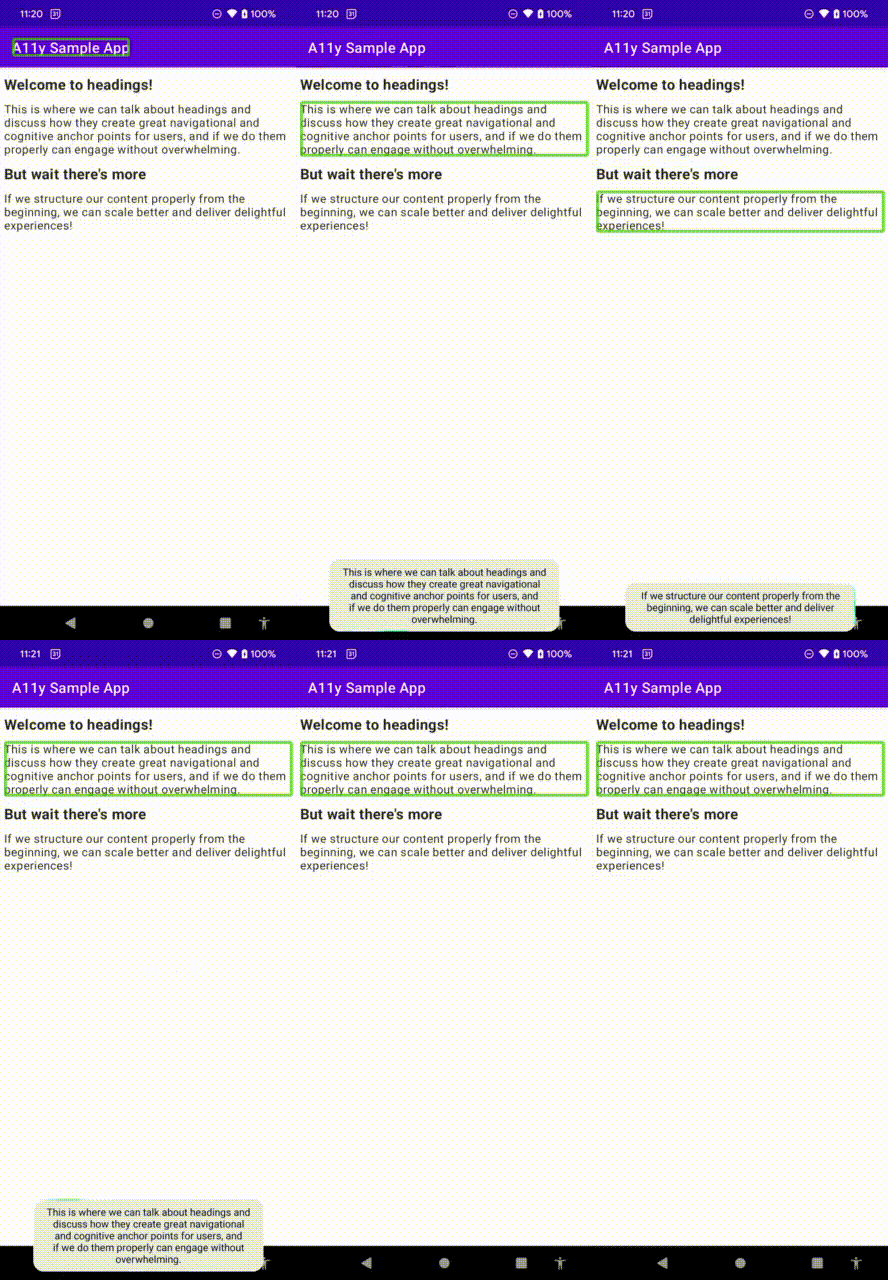
For example, a tester will inform the developer “The heading at the top of the page needs to announce as a heading by a screen reader”. So the developer turns on a screen reader and recognizes the problem: It reads the text of the TextView. So the solution must be to have a screen reader articulate “heading,” but the word heading must not appear on the screen. This is where the anti-pattern comes in: adding a contentDescription to the TextView.
// in XML
<TextView
     android:layout_width="match_parent"
     android:layout_height="wrap_content"
     android:text="@string/my_content"
     android:contentDescription="@string/my_content_heading"
 />;

// in strings.xml
<string name="my_content">The Most Awesome Thing</string>
<string name="my_content_heading">The Most Awesome Thing, Heading</string>// in Composable
Text(
text = getString(R.string.my_content),
modifier = Modifier.semantics {
contentDescription =
getString(R.string.my_content_heading)
}
)
// in strings.xml
<string name="my_content">The Most Awesome Thing</string>
<string name="my_content_heading">The Most Awesome Thing, Heading</string>This results in the following screen reader user experience:

While this results in “heading” to be read out, it is useless for screen reader navigation.
Why does it matter
Other than negatively impacting your user, you’ve wasted your time, and probably your money if you have your app translated. Not only does your localization team now have to translate the heading twice, they might not translate “heading” into the same word or in the same order that TalkBack uses. This would then add to the user confusion and potential frustration. Simply put, this does not scale, nor is it operable.

In addition, there whole issue of styling comes into play. The amount of work to make something look unique takes time, and if you need to change that element, you would need to do it everywhere of have some kind of “reference” style. But headings are already a reference you can programmatically use (in Jetpack Compose, anyway). Rather define the set of attributes for a heading (including the semantic properties of being a heading) in one place. This provides users with a consistent experience, and developers with a scalable mechanism.
Headings in Android
User experience
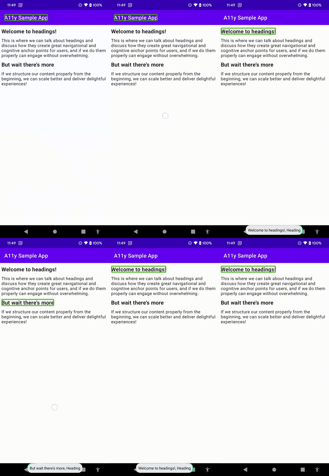
So what is a heading, from a structural point of view? First I think we need to bring it back to one of the most important stakeholders: the user. There is no point in even having headings in your application if no one can use them properly. Below is a small test app with headings, being navigated by a screen reader user. On the left using the default experience, and then on the right with the heading experience.
| [Demo: Default Granularity] | [Demo: Headings Granularity] |
|---|---|
 |
 |
Be aware that users can seamlessly interchange between these two modes, using the granularity selection, as seen in the development anti-pattern demo
However there are far more to headings than just screen reader compatibility. Visually, they can separate content in a manner that makes it easier to ingest. Think about when the last time you actually tried to read terms and conditions - the walls of text are really difficult to navigate (without considering the convoluted language). But imagine if there were no headings or styling to make distinct blocks! This is an application of Millers Law, and can be used to defend design decisions where content may cause a cognitive burden.
The average person can only keep [a limited set of] items in their working memory. 1
Headings done right
The correct way method is to mark an element as a heading. This can be done using several different methods, depending on the architectural need. There is documentation available for both XML and Jetpack Compose. It’s important to note that if you support an API level less than 28, you will need to add an if statement or have an alternate layout file.
// in styles.xml -> for scalability
<style name="heading_style">
    <item name="android:accessibilityHeading">true</item>
    <item name="android:textStyle">bold</item>
    <item name="android:textSize">18sp</item>
</style>

// in the XML layout file
<TextView
    android:layout_width="match_parent"
    android:layout_height="wrap_content"
    style="@style/heading_style"
    android:text="R.string.YOUR_TITLE"
/>// in code, preferably onCreate or onResume
// https://developer.android.com/reference/android/view/View#setAccessibilityHeading(boolean)
if (Build.VERSION.SDK_INT >= Build.VERSION_CODES.P) {
[VIEW].isAccessibilityHeading = true
}Text(
text = ...,
style = ...,
modifier = Modifier.semantics { heading() }
)Testing
In my previous post, I critiqued the “all-in-one” solutions to automated accessibility testing. Headings are one of the first elements that come to mind in terms of intentionality. There is no magic answer to detecting whether something should be a heading or not. Since this is an attribute that can be added, there must be a mechanism to ensure it remains a heading. While you should always manually test headings, how could you add this to your automation? We could create quite a matcher or an assertion that insists a view is an accessibility heading:
import android.view.View
import org.hamcrest.Description
import org.hamcrest.TypeSafeMatcher

/**
 * Determines whether a [view] is an accessibility heading
 *
 * Usage:
 * [VIEW].check(matches(IsHeading()))
 * [VIEW].check(matches(not(IsHeading())))
 */
class IsHeading : TypeSafeMatcher<View>() {
    override fun describeTo(description: Description?) {
        description?.apply {
            appendText("Checking the whether received view ")
            appendText(View::class.java.simpleName)
            appendText(" is an accessibility heading")
        }
    }

    override fun matchesSafely(item: View?): Boolean =
        item?.isAccessibilityHeading ?: false
}import android.view.View
import androidx.test.espresso.NoMatchingViewException
import androidx.test.espresso.ViewAssertion
import androidx.test.espresso.matcher.ViewMatchers
import org.hamcrest.CoreMatchers
/**
* Determines whether a [view] is an accessibility heading
*
* Usage:
* [VIEW].check(AccessibilityMatchers.isHeading()))
* [VIEW].check(AccessibilityMatchers.isHeading(false))
*/
class AccessibilityMatchers {
private class IsAccessibilityHeadingViewAssertion(val mustBeHeading: Boolean) : ViewAssertion {
override fun check(view: View, noViewFoundException: NoMatchingViewException?) {
ViewMatchers.assertThat(view.isAccessibilityHeading, CoreMatchers.equalTo(mustBeHeading))
}
}
companion object {
fun isHeading(mustBeHeading: Boolean = true): ViewAssertion = IsAccessibilityHeadingViewAssertion(mustBeHeading)
}
}Headings coupled with controls
In Android, we can create actions for any view object - this can be done in code that relates to XML based views or Jetpack compose views. While we may want to group objects as a heading, for example, if the heading is constructed of many different TextViews for styling, it’s not recommended that we include actions and controls inside that grouping.
The fundamental principle for a user navigating via headings is currently in an “exploratory” mode. They are looking for a section that best describes the functionality for which they are looking. By adding actions and controls developers are diluting that experience and it may create additional confusion and frustration.
It’s considered good practice to keep headings separate, and have grouped controls and actions under the heading that describes them best.
Conclusion
I strongly recommend developers keep a close watch on the development of headings, as Jetpack compose becomes the more dominant mechanism for defining Android user interfaces, we are going to need to know about proper heading layering (H1, H2, etc.). Headings are a useful construct for users and even more utility has been added by screen reader navigation to allow folks to navigate our content. Remember, the more robust (“do it right the first time”) we make our code, the less regressions we will have, and the more reusable and re-deployable our apps will be. Ultimately, we should want users to enjoy exploring our content.
Footnotes
1The reason why I do not specify a number, specifically 7, is because:
- Initially the number was thought to be around 7 plus or minus 2. But that is already admitting there is definitive variation within human-kind, and then some design folks might erroneously say that your menus should only have 7 items in them - but menus are always there, users require no short term memory for that.
- Miller failed to account for both content size and age, making the distribution of elements the key factor from his research.
- More recent research has found that 4 is a more realistic number
Bonus section: Headings inside a RecyclerView
In a recent StackOverflow question, I had a great discussion with a developer on the appropriate mechanism to have headings in a RecyclerView. RecyclerViews are specifically useful to developers because they are performant. They optimize the user experience by not loading all elements into a potentially long list. This makes scrolling far smoother, because the component handles the “recycling” of list elements as they are scrolled out of user view.
When an item scrolls off the screen,
RecyclerViews don’t destroy theirviews. Instead,RecyclerViews reuse theviewfor new items that have scrolled onscreen.RecyclerViews improve performance and your app’s responsiveness, and it reduces power consumption.
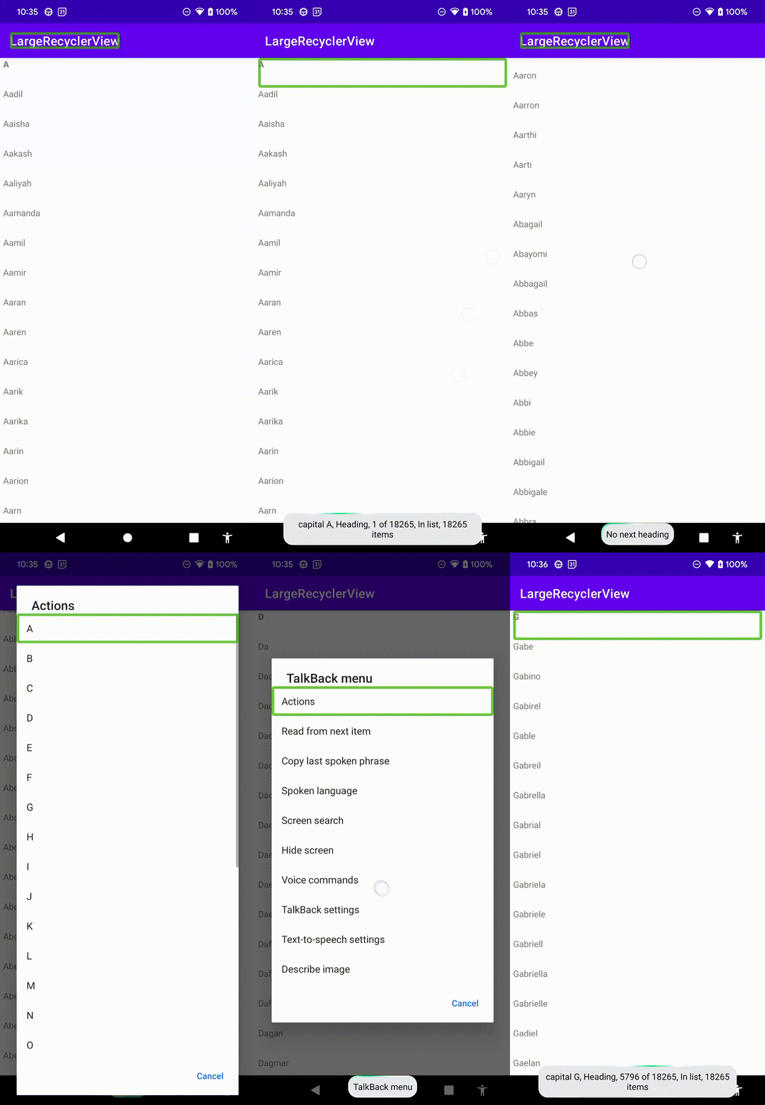
The problem though, is that any headings we may have inside those elements are now lost to screen reader users. I tested this in the contact app of the Google Pixel, and there are no headings. Without a filter (which I highly recommend as well), this can become a nightmare for users. So I thought I would propose dynamic action creation. The fist thing I did was create a mechanism in my adapter object to create the headings and group them with the data. This could also be done manually.
    sealed class ListItem {
        data class Item(rawItem: [Type]): ListItem()
        data class Header(val heading: String): ListItem()
    }
    //...
    private val dataSet: List<ListItem>
    init {
        val sorted = rawData.sorted()
        val headings = sorted
            .map { /* create a mechanism for turning an element into a heading, expect duplicates */ }
            .toSortedSet() // removes the duplicates
            .map { item -> ListItem.Header(item) } // create a list of heading elements
        val everything = mutableListOf<ListItem>().apply {
            addAll(headings)
            addAll(sorted.map { rawItem -> ListItem.Item(rawItem) })
        }
        dataSet = everything.sortedBy { /* Sort so that headings are in their correct positions */ }
    }
    ...
    // remember when binding, to either set the item as a heading or to remove the heading!
    private fun makeHeading(myView: View, isHeading: Boolean) {
        if (Build.VERSION.SDK_INT >= Build.VERSION_CODES.P) {
            myView.isAccessibilityHeading = isHeading
        }
    }

    fun bind(data: ListItem) {
        when (data) {
            is ListItem.Header -> {
                // bind heading
                makeHeading(view, true)
            }
            is ListItem.Item -> {
                // bind data
                makeHeading(view, false)
            }
        }
    }
After that, I provided a mechanism of finding the heading position within the adapter
    fun headingPositions(): Map<String, Int> =
        dataSet
            .filterIsInstance<ListItem.Header>()
            .associate { heading ->
                heading.text to dataSet.indexOf(heading)
            }
Then the RecyclerView just needed to have the actions added to it:
recyclerView.apply {
    adapter = AccessibleAdapter(namesDataSource.readFile()).also { myAdapter ->
        myAdapter
            .headingPositions()
            .map { headingWithPosition ->
                ViewCompat.addAccessibilityAction(
                    this, headingWithPosition.key
                ) { _, _ ->
                    recyclerViewLayoutManager.scrollToPositionWithOffset(headingWithPosition.value, 0)
                    true
                }
            }
    }
}
The resulting experience:

Comments
No comments found for this article.
Join the discussion for this article on github. Comments appear on this page instantly.